CASE STUDY
JERRY CANTRELL
BRIGHTEN
ART DIRECTION, ILLUSTRATION & DESIGN BY RYAN CLARK
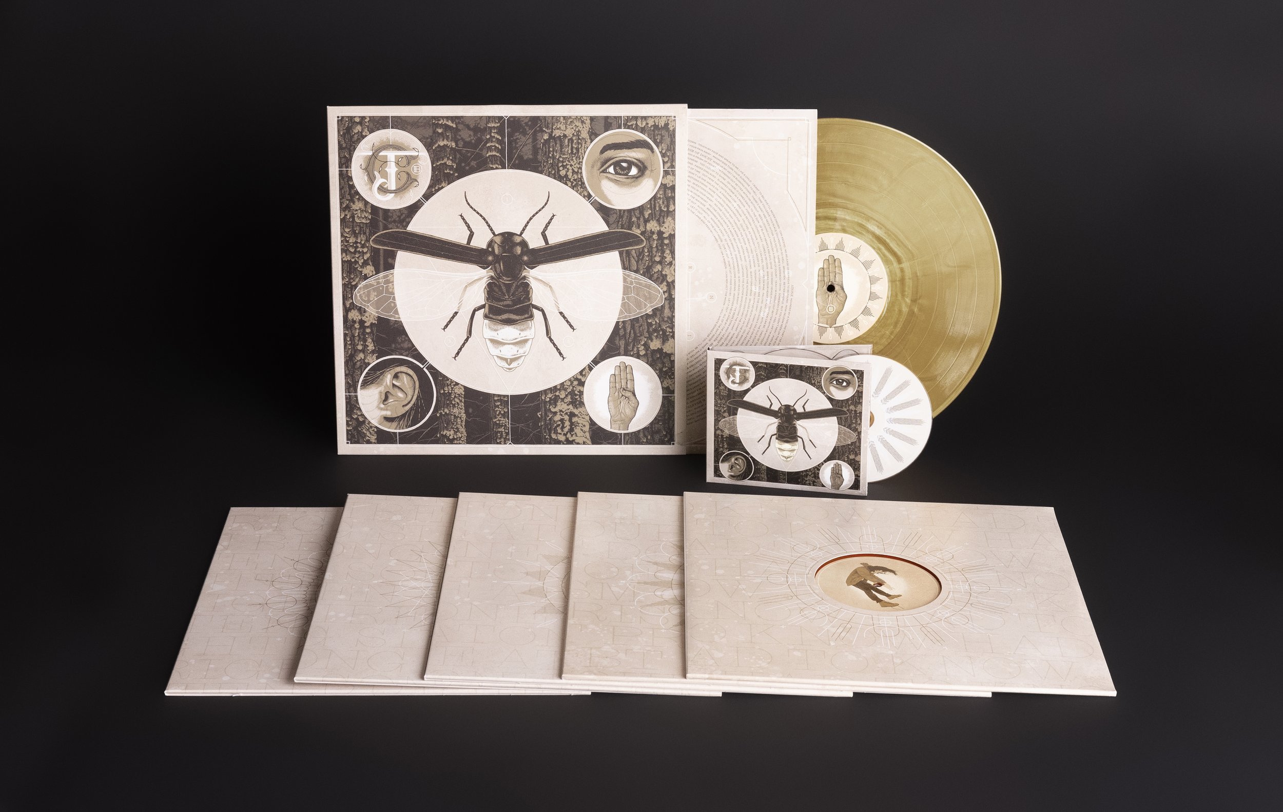
The cover for Brighten is quite possibly the most time-consuming piece of album art we’ve created. The image was first mapped out using photographic references, then meticulously stippled digitally with a stylus and tablet. This detailed pointillism illustration represents the multi-sensory experience of listening to an album.
Being that Jerry’s previous solo album covers were primarily photographic, we opted to take a more illustrative approach… and given the dark tones gracing his other records, we took Brighten in a lighter direction. The album title was not ironic. Jerry himself described it as a more “optimistic" release. It made sense that the artwork reflected the same sentiment.
Given the visual nature of the title itself, it made sense to incorporate an element that conveyed the idea of “brightness” in a somewhat literal sense. We decided to add a layer of glow-in-the-dark ink to illuminate various aspects of the cover and reveal some hidden pieces as well.
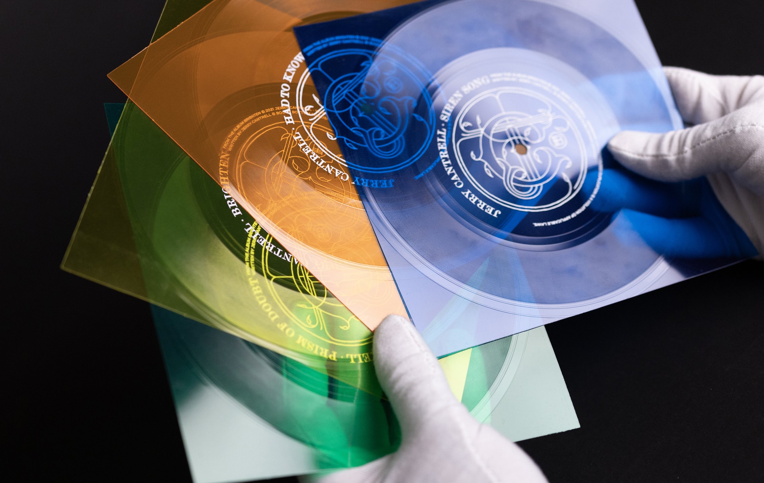
The LP was offered in four completely different color treatments, and five 12-inch singles—each in three different vinyl variants—featured Euro-sleeve-style cutouts revealing custom illustrations on both A and B side labels. All jackets included the glowing ink. Each of the singles were released on various colored flexi discs as well, and the full set was eventually collected in a foil stamped box with a foldout poster.